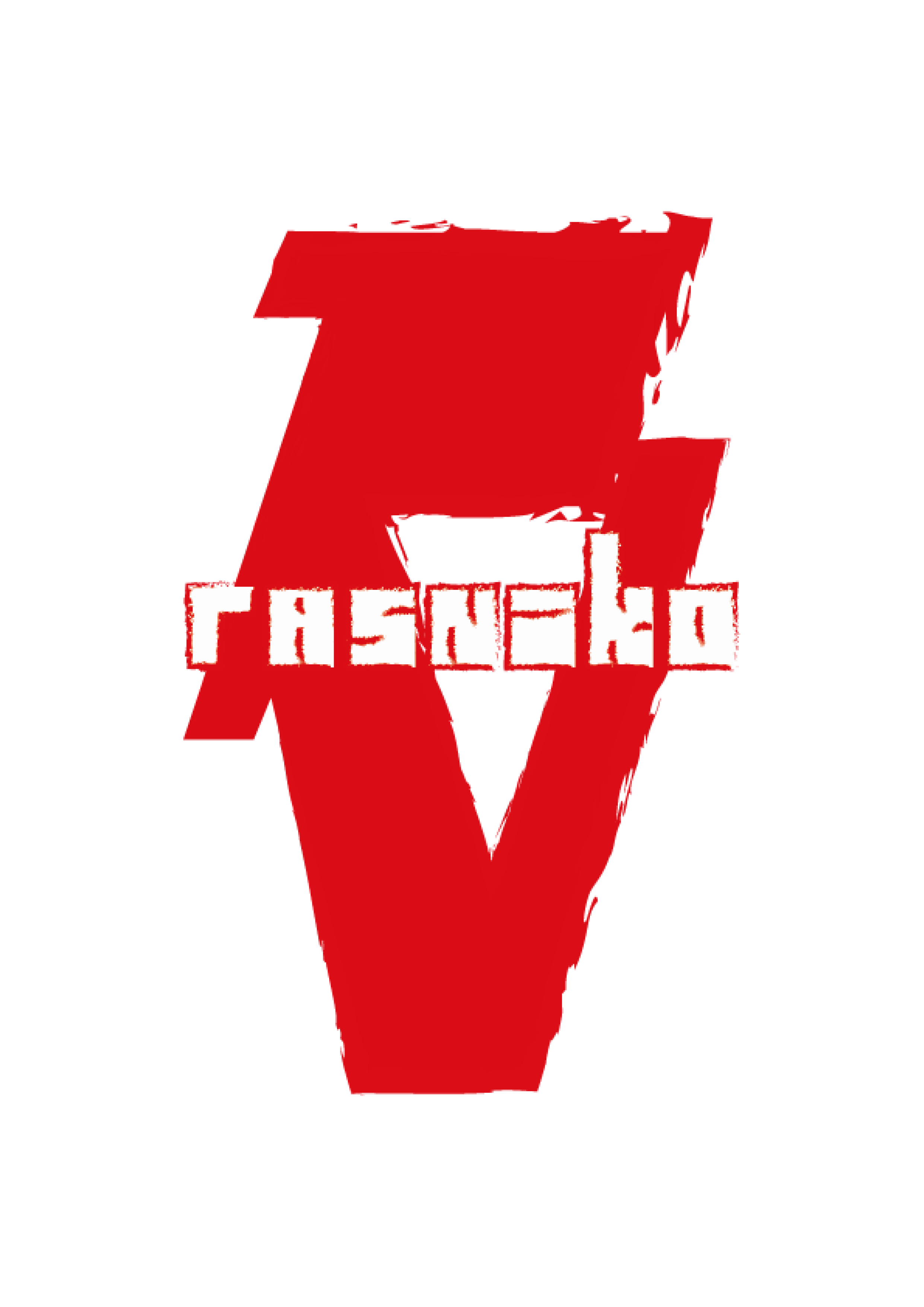
The original logo for a game company: Rasniko.
The idea was that the letters were build up using the same logic as tiles in games which creates an old feel. It is all placed in two letters with a fiery edge, leading the viewer to think of games.

You might also like:
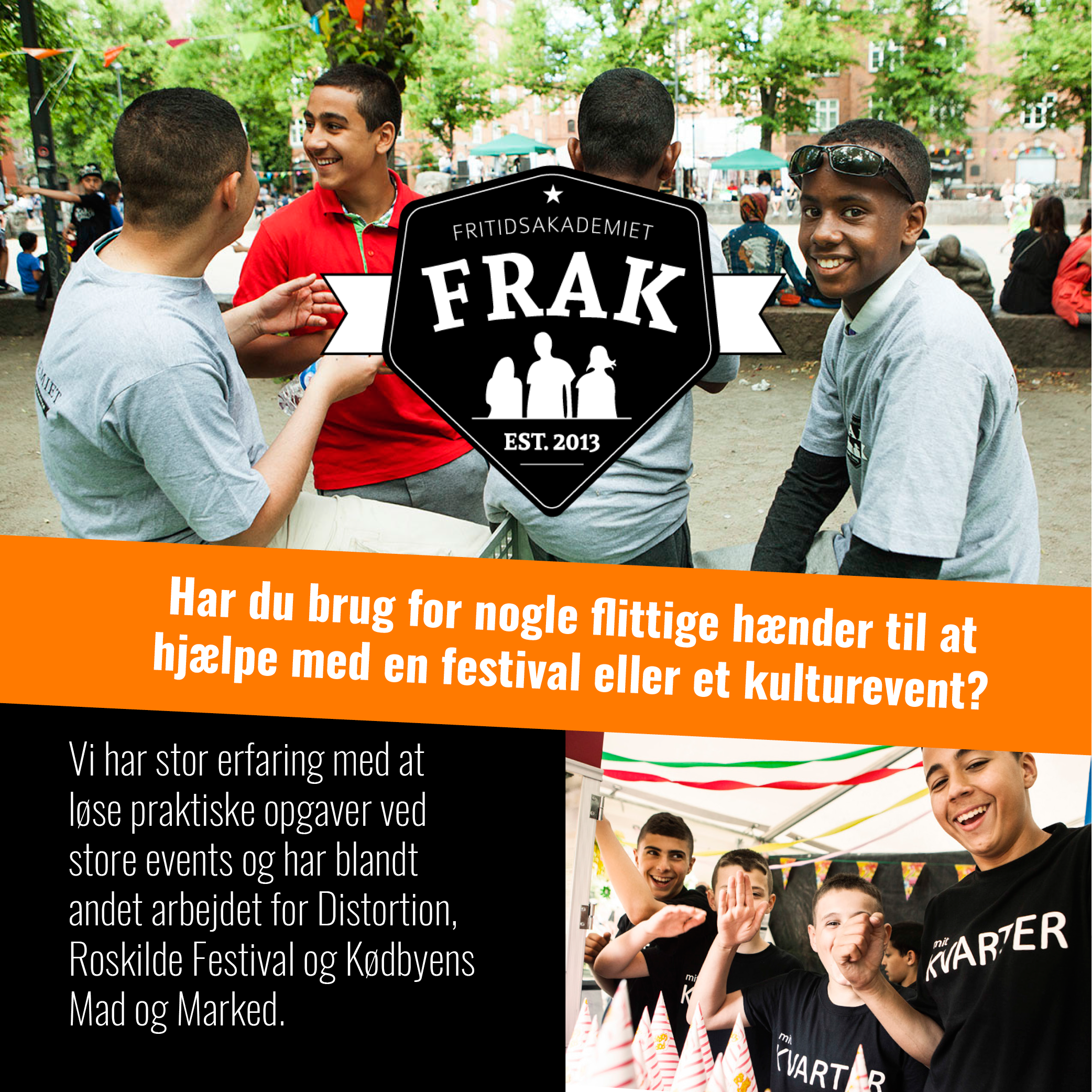
Grafisk opsætning af postkort til FRAK. Plus deres hjemmeside.


